
Basic Box Variations
Color Box Variations
Basic Title Variations
Color Title Variations
The Style Settings panel in the Gantry based theme administration interface provides several options for configuring the main built in stylistic aspects of the template.
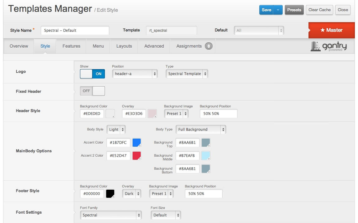
Gantry also provides the ability for you to create your own custom presets based on any parameter in the theme administrator. You should determine which parameters you wish to configure to be a part of the presets.
Assigning a Style
With Gantry, the ability to assign a certain style to an individual page has never been easier and/or more efficient. Just follow these simple steps:
- Go to Extensions → Template Manager → rt_spectral → Assignments → *Menu Item*
- Select your preset from Show Presets, configure and save.
After setting your defaults to the desired values, select the Menu Items button and choose the menu item you wish to modify the parameters for. You will then see a series of checkboxes on the left of all the supported parameters.
Select the checkbox next to the parameter you wish to modify, it will then become active, and you can modify as you wish. Clicking “Save” in the toolbar will then save this configuration.
Gantry Framework: Style ConfigurationThere are 8 stylistic module class suffixes which provide a unique style variation to the module: title1-4 and box1-4. There are also various additional structural suffixes, these affect the layout and metrics of the module.
Furthermore, you can also add FontAwesome icons into the Module Class Suffix. You will get a medium sized icon to the left of the title. Suffixes are in the icon-NAME format such as icon-star, as shown on the Typography page.
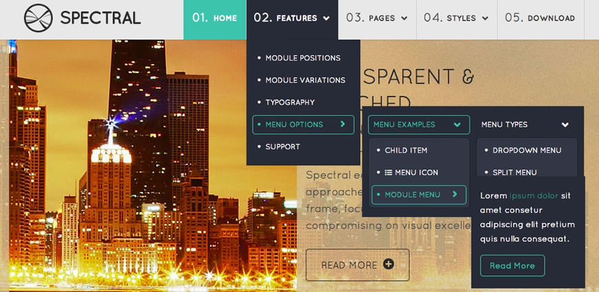
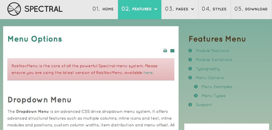
RokNavMenu is the core of all the powerful Spectral menu system. Please ensure you are using the latest version of RokNavMenu, available here.
Dropdown Menu
The Dropdown Menu is an advanced CSS drive dropdown menu system. It offers advanced structural features such as multiple columns, inline icons and text, inline modules and positions, custom column widths, item distribution and menu offset. All of these are configurable for each menu item.
SplitMenu
A static menu system that displays 1st level items in the main horizontal menu and further children in the Sidebar.
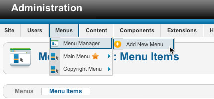
All Menu Items can be edited from Admin → Menu → Menu Name → Menu Item.
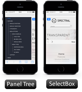
Responsive Mode: Smartphone
For mobile devices, there are two options, a dropdown panel menu with items in a tree format or a select box using the browsers own UI elements. Chose a format in the template's menu settings.
The mobile menu is active for both the Dropdown Menu and SplitMenu.
Creating child menu items
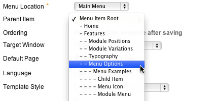
Go to Admin → Menu → A Menu → A Menu Item → Select a Parent Item, and it will appear as a child of it.
Header |
|||||
|---|---|---|---|---|---|
| A | B | C | D | E | F |
Drawer |
|---|
Top |
|||||
|---|---|---|---|---|---|
| A | B | C | D | E | F |
Breadcrumb |
|---|
Showcase |
|||||
|---|---|---|---|---|---|
| A | B | C | D | E | F |
Utility |
|||||
|---|---|---|---|---|---|
| A | B | C | D | E | F |
Feature |
|||||
|---|---|---|---|---|---|
| A | B | C | D | E | F |
MainTop |
|||||
|---|---|---|---|---|---|
| A | B | C | D | E | F |
ExpandedTop |
|||||
|---|---|---|---|---|---|
| A | B | C | D | E | F |
Content Top |
||
|---|---|---|
| A | B | C |
Mainbody |
|---|
Content Bottom |
||
|---|---|---|
| A | B | C |
Sidebar |
||
|---|---|---|
| A | B | C |
MainBottom |
|||||
|---|---|---|---|---|---|
| A | B | C | D | E | F |
ExpandedBottom |
|||||
|---|---|---|---|---|---|
| A | B | C | D | E | F |
Extension |
|||||
|---|---|---|---|---|---|
| A | B | C | D | E | F |
FullWidth |
|---|
Bottom |
|||||
|---|---|---|---|---|---|
| A | B | C | D | E | F |
Footer |
|||||
|---|---|---|---|---|---|
| A | B | C | D | E | F |
Copyright |
|||||
|---|---|---|---|---|---|
| A | B | C | D | E | F |
Debug |
|---|
Analytics |
|---|